Uncategorized
Differences Between Giclée Prints and Digital Prints
Jul
Colours have a very important role in our illustrations and artwork in general, so I would like to explain why I choose giclée printing for my designs instead of standard digital printing.
In this article we will explain the differences between a fine art ‘giclée’ print and a standard digital print. When is it better to choose one or the other?
What is a Standard Digital Print?
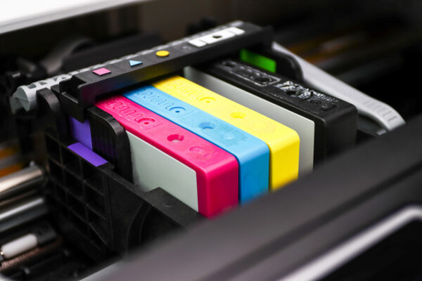
A standard digital print is more basic. Think of the regular prints you might get at a print shop or at home. These printers usually use just four colours—cyan, magenta, yellow, and black (CMYK). They do a good job, but they are not as detailed as giclée prints.
What is a Giclée Print?
“Giclée” comes from the French word ‘gicleur’ that means to squirt or spray.
Giclée print is all about high quality, it’s a fine art digital printing process.
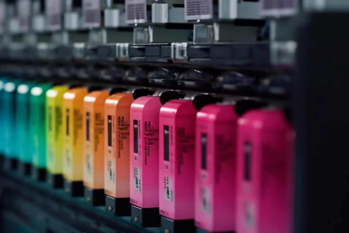
A giclée printer is a fancy inkjet printer that goes beyond the usual CMYK inks by adding extra ones like light cyan, light magenta, and sometimes even orange and green. It can mix up to 12 different pigment-based inks, extending its colour gamut and thus, surpassing the standard CMYK printing. This means it can produce more colour variations and more accurate colours.
Giclée printers typically use additional inks beyond CMYK
The goal is to produce prints that look just like the original artwork where every detail is captured.
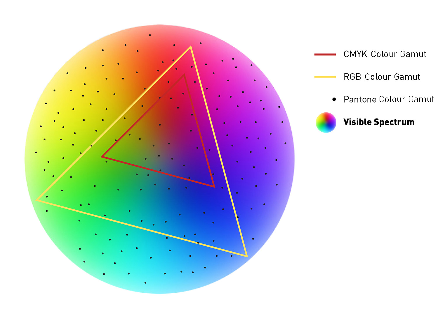
To ensure high-quality giclée prints is is important to save the artwork in RGB format because it offers the widest colour gamut possible for printing*️⃣. Although giclée printers uses CMYK inks, they convert the RGB file to CMYK during the printing process.
*️⃣See chart at the botton of the page to help you understand how each colour gamut compares to the visible spectrum.

Key Differences

Standard Digital Print
-
Printing Process:
Uses regular printers with the basic CMYK colour set —cyan, magenta, yellow, and black.
-
Ink:
Dye-based inks, which can fade faster.
-
Paper:
Usually printed on regular paper, which isn’t as durable.
-
Quality:
Lower resolution and less accurate colours. It’s good, but not as detailed.
-
Longevity:
Prints can fade much quicker, especially if exposed to light and humidity.
-
Cost:
More affordable, great for everyday use or mass production.
-
Why Choose Standard Prints?
For everyday needs, standard prints are just fine. They’re cheaper and still look pretty good. They’re great for things like posters, flyers, and other materials where you don’t need high-quality prints and cost is a factor.

Giclée Print
-
Printing Process:
Uses high-end inkjet printers with up to 12-colour printing system so the colours will be more accurate to your original artwork.
-
Ink:
Pigment-based inks, which last longer and look better.
-
Paper:
Printed on high-quality, acid free archival-grade paper or canvas.
-
Quality:
High resolution and great colour accuracy. It captures fine details perfectly.
-
Longevity:
Prints can last over 85+ years without fading.
-
Cost:
More expensive due to the high-quality materials and process.
-
Why Choose Giclée?
If you’re looking for a print that’s almost identical to the original artwork, go for giclée. The colours are vibrant, the details are sharp, and it will last a lifetime. It’s worth the extra cost if you want something special.
*️⃣Basic chart of different colours gamut vs visible spectrum
First explaining that in digital and print design, a colour gamut is the range of colours that can be produced by a specific device or colour space. The RGB colour gamut, used in digital screens (like monitors and televisions), is generally larger than the CMYK colour gamut, used in print. This means that a broader range of colours can be achieved using RGB compared to CMYK.
- CMYK:
The colour space is subtractive, meaning it creates colours by combining cyan, magenta, yellow, and black inks. The more ink you add, the closer you get to black.
Range: Limited, especially in vibrant greens and blues. - RGB:
The colour space is additive, meaning it creates colours by combining red, green, and blue light. The more light is emitted, the closer you get to white. If there is no light, it will be black.
Range: the colour gamut is much larger than the CMYK colour gamut, especially in bright colours and deep blues. - Pantone:
The colour space is often referred to as the Pantone Matching System (PMS). The PMS consists of a large palette of colours, each with a unique identification number. They are created using specific ink formulations, ensuring precise colour matching in print and manufacturing processes. While Pantone colours are primarily used for spot colour printing, they can also be converted to CMYK for wider applications, though exact colour replication may not always be possible due to the limited gamut of CMYK.
Each small circle represents a specific Pantone colour. - Visible Spectrum: The entire circle represents the visible spectrum, the full range of colours humans can see.
Conclusion
If you want quality and longevity, giclée prints are the best option. They use better materials and more advanced printing technology. But if you need something quick, affordable, and decent, standard prints will do the job just fine.
Choosing the right type of print depends on what you need it for and how much you’re willing to spend. Now you know the differences and here the reason why we always choose Giclée printing for our illustrations!